A commission to get excited about-
After all the scuttling preliminary stuff- phone calls, meetings, contracts, schedules, etc. are out of the way, I am left with the eminent opportunity to create in the studio once again.
For this Commission, five core values (Truth- Commitment- Joy- Connection- and All Four) were chosen by the client.
I started as I always do in the dictionary then I research out from that by spending time in their office, interviewing their employees, and then following up with drawings & ideas- which chooses the parts and path to head out from.
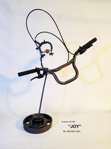
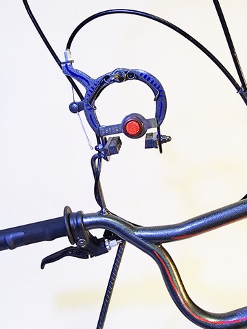
“JOY”– sculpture No. 884
Please note this piece was designed to hang on the wall or stay on a stand.
This sculpture topic is one of the artists’ favorites.
For this sculpture piece a memory was used, and the parts were all chosen to support this simple memory and feeling of “Joy”.
Childhood delight……
Think back to when you and your friends were together on bicycles going to race down the BIG hill.
One- Two- Three- GO,,,,,,
Your hands grip tight
The wind on your face
Your pants swish with every stroke
The chain slapping with a -Clack -Clack -Clack against the guard
Peddle as hard as you can
In heart ponding rhythm
feeling Free
Moving Fast enough to Fly!
In the end,
so out of breadth——
yet the smell, of laying on the fresh-cut grass
fills with joyful delirium
Blue sky that echoes summer
laugh so hard the tummy hurts.
Joy -there’s nothing like it, even the memory inspires a smile.
Joy heals- inspires- it’s contagious!
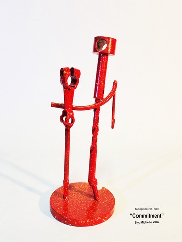
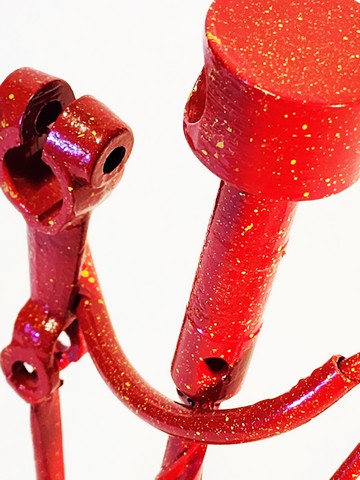
“COMMITMENT” -Sculpture No. 880
The sculpture description is as follows:
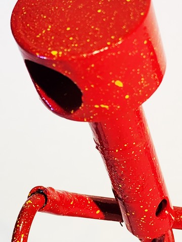
The first thing that strikes one’s sensibilities is the color of the sculpture -red, which was chosen for passion, energy, and intensity. The red is spattered with yellow which is associated with happiness, sunshine, and growth.
The anthropomorphic figures stand a top of a round circle tying the overall core company principles to history and ideas of commitment, which create a solid core foundation to move as one energy.
The top parts are chosen for their subliminal representation of what their actual use was. They were steering- (steering towards a trajectory) and breaking (keeping on an agreed course). Those parts are from a 1930 Ford Model A, which inherently represents, the agreement and balance of a committed relationship. The parts I am referring to have holes through them, insinuating nothing hidden, all information shared.
While the figures are strung together with a small steel gas line made into the shape of a smile for positive interactions. The gas line is where information is shuttled to and from each figure, holding one another equal in a life center, that ends with a clip used to hold heavy objects together which was drawn down into the hook, solidifying good unified outcomes through commitment, together.
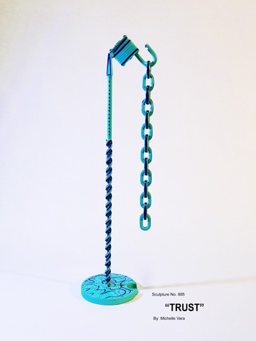
Trust – Sculpture No.885
Description of sculpture –
The currency of trust is both the hardest to gain and easiest to lose.
Social goods are built on the currency of trust. The practice of sharing knowledge in communities is now common among researchers, civil society, and open government projects.
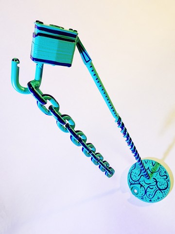
Here like in the other sculptures in the series, you see the work rise from a circle insinuating all that comes around goes around.
The first notable object in the sculpture is the lock which symbolizes security and with the lock open it screams trust and freedom.
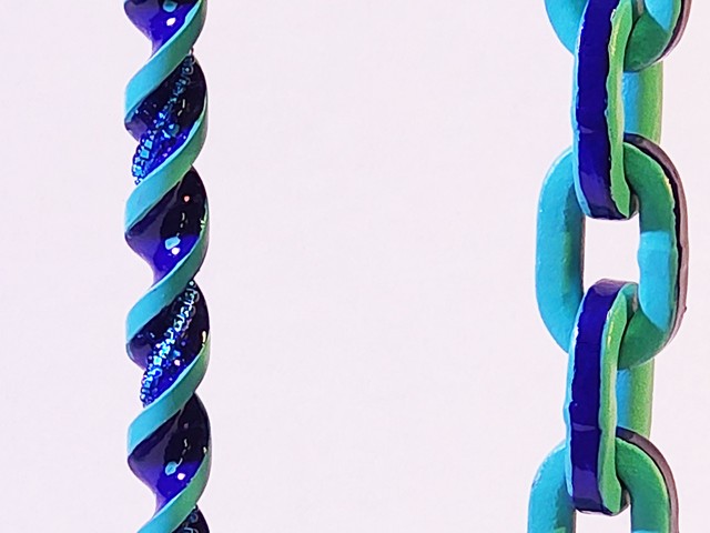
Following that comes the loose hanging chain which unbinds any notion of mistrust throwing open the catacomb of creative life and imagination. The chain is a hand-forged square link chain talking to the ideas of forging unique commitments and connections through trust.
The paint is meant to accentuate how trust has a dark side that swirls up and down the shaft as if two sides of a coin. The shaft that holds the lock and chain has glass embellishments speaking to life’s journey and how things can be.
Michelle uses the overall finish colors of teal and dark blue to slam home the sincerity of trust, that the sculpture communicates.
Google says “Teal combines the calming properties of blue with the renewal qualities of green. It is a revitalizing and rejuvenating color that also represents open communication and clarity of thought. For Tibetan monks, teal is symbolic of the infinity of the sea and sky, while it is the color of truth and faith for Egyptians.”
Connection- Sculpture No.888
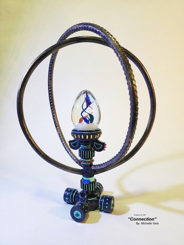
The material description is as follows:
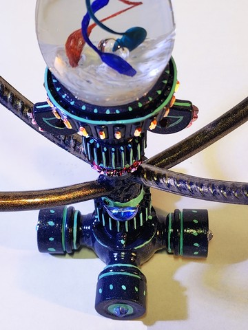
The base is the splined end of a 1930 Model A Ford drive shaft to represent the drive, of connection to create a forward motion, and the history of change in doing something new (ie: Henry Ford).
The sprockets which sit atop are another connecting point each tooth smoothly rides along another dependent of the other to propel productivity and complete a designed task, and outcome.
Bling: the glass embellishments are some of the first Austria Kristall made and traveled with a family to the United States during war times. This makes the embellishments loaded with history and positive energy. The embellishments have been handed down 2 times before Michelle’s recent acquisition.
Circles carry the heavy burden of massive implications (science, spiritual, etc.) over hundreds of years. These circles are made from- not your regular rebar, in 1970 this round stock was handmade in a Michigan steel plant with hash marks. For this piece, the hash marks represent the things we go through to get to our destination. The steel was manipulated into the circles and prompts the representation of connection back to the company’s core ideas (ie: “The company’s commitment to quality” or “Similar: dedication, devotion, allegiance, loyalty, faithfulness, fidelity, bond, adherence, attentiveness”).
(Fingerpaint Handbook 2022)
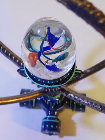
The glass centerpiece was acquired while the artist was in the South of Italy from an artist glass blower and small business. Michelle believes it has all the correct commentary energy and colors of connected forces setting this sculpture to the perfect finish.
“Amalgam Four” -sculpture No. 883
Sculpture details-
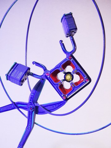
For this sculpture series, the piece Amalgam Four is the culmination of four core values – (A.) Connection, B.) Commitment C.) Trust, D.) Joy,) that the Fingerpaint Marketing family chose and holds in high regard.
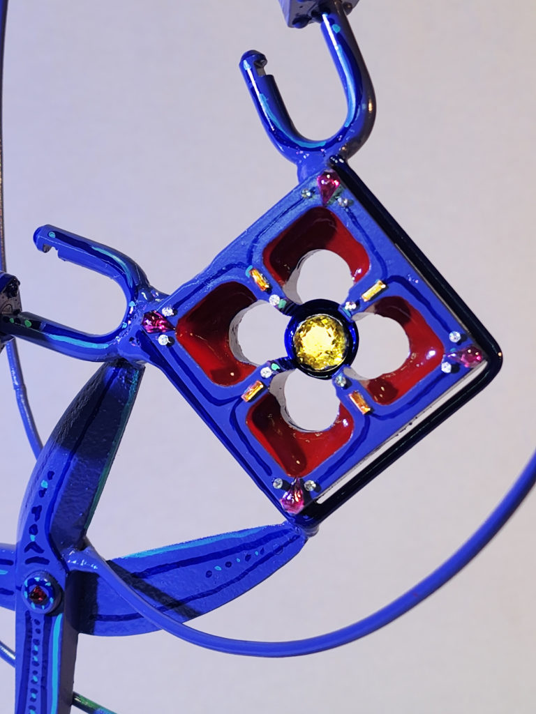
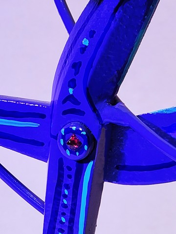
This sculpture piece is finished in a unique color, whispering commentary of standing apart in excellence, while highlighted by antique glass embellishments that bring Bling to an unnoticed level of smoothness.
The sheers are two pieces the same yet opposite to create one working order, offer a forward thrust of energy- bring thinking to new levels, and hold a unique degree of balance in success. A leader is not one person but a team of people working as one united energy which is signified by the centerpiece, a gold crescendo.
The glass embellishments are some of the first Austria Kristall made and traveled with a family to the United States during war times. The embellishments are meant to highlight the positive energy experienced while the artist spent physical time in the FP Saratoga NY office interacting with the staff.
The artist uses reclaimed objects as a placeholder for memory and energy to stimulate personal narrative from the onlooker. The reclaimed objects naturally come loaded with history which enhances the context of the sculpture’s subliminal conversation.
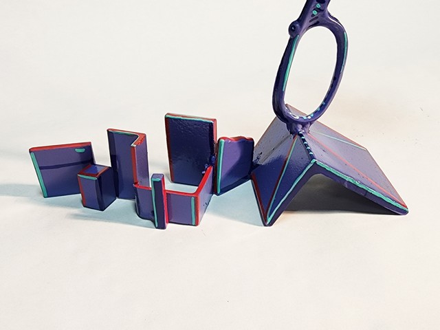
The base of the sculpture is in response to the FP building’s upstairs windows. The base is made of small pieces of metal which were collected from around the City of Saratoga and meant to represent FP’s deep community roots. The lines follow a trail left by the story FP shares in a small town.
The angel or pyramid where the sheers balance on, in a forward motion, cut into the atmosphere of the circles that bring hundreds of years of metaphoric meaning to the table. The sheers hold an intricate square- die, signifying the unique box of advertising and the shaped holes let light and air into a complicated and competitive field of work as their employees sparkle like the highlighted Kristall which embellishes it. The past life as a commercial threading die, wink- at the long hours of labor and its physical job of connecting opposites as a joined union. The painterly lines highlight a winning marketing team that works within advertising’s unique box. On the square, die are two open locks which symbolize security, and with the lock open it screams the ethos of trust.